Designing for Grief: The Case of Perdurai
Some products are designed to capture attention. Perdurai was designed for the opposite: to ask for as little attention as possible from someone who has none to give.
This is a case study on how we approached the design of a digital obituary platform: the problem, the hypotheses, the UX decisions we made, and the ones we intentionally discarded. It is written from the perspective of product and design engineering, but the thread is only one: respecting the mental state of the person using the product.
The Context: Designing for Minimum Energy
Almost the entire modern UX playbook assumes an available user. Someone with curiosity, willing to explore, whom we can ask to register, complete their profile, or discover features. Grief reverses this assumption completely.
Someone who has just lost a loved one operates with a saturated mind. Urgent logistical decisions, phone calls to make, paperwork they don’t understand, and an emotional load covering everything. In that state, every form field is a toll and every unnecessary decision is a small cruelty.
Grief completely reverses the modern UX playbook: we do not design for the ideal or curious user, but for the exhausted user. If something works for someone who can barely concentrate, it will work for everyone else.
The project’s first principle emerged from there: we do not design for the ideal user, but for the exhausted user. If something works for someone who can barely concentrate, it will work for everyone else.
The Real Need
When observing what a family actually does during the first few days, a clear and poorly resolved pattern appeared:
- They need to communicate the news to many people without repeating the story twenty times or posting something painful on social media.
- They receive an avalanche of condolence messages scattered across WhatsApp, calls, and comments.
- They face administrative procedures that no one has explained to them, at a moment when they cannot start researching.
Each of those needs had partial solutions: WhatsApp groups, newspaper obituaries, midnight Google searches. But nothing connected them. The opportunity was not to invent a new feature, but to provide a central thread to a chaos currently managed by hand.
Product Hypotheses
We started with three hypotheses that guided everything else:
- If we reduce creation to the bare minimum, people will complete the obituary even if they are exhausted (name and date are enough to start; the rest can wait).
- If we centralize communication, condolences, and paperwork in a single link, the family regains control over something that is currently scattered.
- If privacy is the default state and not an option to look for, families will trust the tool enough to use it at such an intimate moment.
None of the three are certainties yet: they are design bets that the product is there to validate.
Design Principles
Before touching a single screen, we established the principles that would have the final say in every discussion:
- Support, don’t complicate: Every feature must remove weight, never add it. If a screen demands effort without offering relief, it’s redundant.
- Privacy by default: Control over who sees and comments is active out of the box, not hidden in settings.
- No jargon: A 70-year-old must be able to use it from their mobile phone, without a pre-existing account or jargon.
- Calm is a design decision: Serene typography, unhurried pacing, non-pressuring copy. Tone is also UX.
- AI proposes, the family decides: Automatic assistance never publishes on its own or blocks a flow.
These principles are not decorative: every time we hesitated between two paths, the one that respected them won.
Key UX Decisions
Passwordless Access
Asking to create a password in the middle of grief is absurd. Access is via a magic link: you enter your email and enter through the link you receive. One less friction in the worst possible moment.
Starting is Free, Finishing Can Wait
The creation wizard asks for the minimum to get started and allows you to save as a draft at any step. Anyone who doesn’t have the energy to complete everything at once doesn’t have to. Coming back later is part of the flow, not an exception.
Help to Find the Words
Writing a few parting lines can be the hardest part. We offer a starting draft that the user can use, edit, or discard. The key: it is optional and never blocks. The final word is always the family’s.
Moderation as an Act of Care
The guestbook is public, but whoever manages the obituary decides what is shown. This is not a cold control feature, but a way to protect the family from an inappropriate message in a vulnerable moment.
Paperwork Integrated, Not Linked
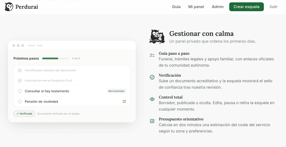
Instead of sending the user to search elsewhere, the step-by-step guide lives inside: what to do, why it matters, and where to go, with resources from their community. The product also accompanies them in the administrative aspects, which is where people feel most alone.
Comparison of Design Alternatives
- Magic Link (vs. password registration): Less friction at the worst possible moment. No one wants to manage passwords or deal with recovery flows in the middle of grief.
- Draft at any step (vs. single-session form): Respects the user’s intermittent energy. It allows starting with the basics and saving progress to complete it at another time.
- Privacy active by default (vs. public with option to hide): Trust shouldn’t require configuration. Access and comment controls are configured to protect the user from the very first minute.
- Optional AI (vs. automatic text generation): The final message must belong to the family, not the machine. The AI proposes and helps write, but never makes automatic decisions.
The Main Flow
The central path fits into three movements, and this simplicity is deliberate:
1. Write the essentials
Step 1Name, date, a photo if desired, and a few words. With writing assistance if needed.
2. Share with a link
Step 2A unique link and a QR code sent via WhatsApp or email. You write the information once and it reaches everyone.
3. Receive support
Step 3Loved ones leave messages and gestures of support; the family moderates them from a simple dashboard at their own pace.
Everything else stems from those three steps without cluttering them. The platform organizes its functions into four key groups:
- Create & Personalize: A dignified obituary in minutes, with the look the family decides. Includes four templates, AI writing assistant, optional symbols, photo, and biography.
- Share with Everyone: Write information once and let it reach those who need to know. Includes unique link, printable QR code, social media graphics, and controlled visibility.
- Receive & Support: The space where loved ones support the family. Includes moderated guestbook, private invitations, flowers or a tree in memory, and anniversaries.
- Manage Calmly: A private dashboard to organize the first few days. Includes step-by-step paperwork guide with official resources, verification, status control, and budget estimator.
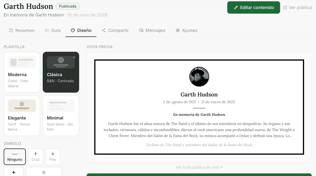
Perdurai private dashboard interface: organizing the first few days with resources and official procedures.
The rule that keeps this clean: advanced features exist, but do not compete for attention in the first minute. Those who just want to communicate the news won’t encounter anything else; those who need more will find it when they look.
What Makes It Different
This is not the first tool to publish an obituary. The difference lies in the approach:
- It centralizes what is currently scattered: communication, condolences, and administrative tasks in one place.
- It treats privacy as the starting point, not just another checkbox.
- It puts tone at the service of the user: sobriety is not aesthetic, it is functional.
- It helps with administrative tasks, an area few address because it doesn’t make headlines.
Challenges and Learnings
The most interesting challenge was not technical, but about restraint: the constant temptation to add. Every new feature seemed useful, and almost every time the correct answer was no. In a product for grief, extra features are not neutral: they are noise on top of someone who cannot handle more noise.
From a design engineering perspective, the key learning was the value of building on a systematic foundation: a layer of tokens as a single source of truth for color and brand, cataloged and reusable components, and documented design decisions. This discipline allowed us to prototype quickly without accumulating debt, and made possible something that validates the solidity of the approach: deriving a sister product for pet grief, reusing almost the entire architecture and essentially changing only the copy and branding.
The core lesson: investing in a design system at the beginning doesn’t slow down speed, it sustains it.
Next Steps
The product is at a stage where hypotheses need contact with reality. The next priorities:
- Validate the three product hypotheses with real-world usage data.
- Deepen the administrative support based on feedback from families.
- Open translated versions of the content, keeping control in the hands of the obituary creator.
- Explore collaboration with those who already accompany families (funeral homes, florists) without losing the user-centered experience.
Closing
Designing for grief teaches something that is easily forgotten in product: that sometimes the best design is the one that is noticed the least. That restraint is a form of respect. And that the right question is not always "what else can we offer?", but "what can we take away to make this weigh less?".
Perdurai is, at its heart, an attempt to answer that question with honesty. Support, don’t complicate. Everything else is noise.
Explore the MVP
Visit the platform and discover how to design a digital obituary with calm and support.