From design system to product platform
When a team needs to launch a new page, adapt a flow, or deploy a product to a new context, the problem is rarely “designing a screen.” The real problem lies elsewhere: rebuilding the same infrastructure, reinterpreting decisions that have already been made, and depending too heavily on a specific tool or a fragile handoff.
Some time ago, I started thinking about a very concrete idea: a design system should not depend on a specific tool to exist, nor on a closed workflow to remain useful. It should be able to survive its tools, evolve alongside the product, and serve as a real foundation for design, frontend engineering, and tooling.
I also began to notice the same shift within other teams: systems that are more structured, better prepared to scale, and increasingly built to be understood not just by humans, but also by workflows assisted by LLMs.
This is where the idea of a code-ready design system is born: it is not just documented or implemented, but ready to live in code, contracts, tokens, and operational rules that allow us to build, maintain, and extend a product without starting from scratch every single time.
The real problem
Many design systems feature components, libraries, documentation, and even a fairly solid visual language. But when it comes to building real products, launching a new page, or adapting an experience to another context, the system too often falls short.
It doesn’t usually fail due to a lack of parts. It fails because it never becomes infrastructure. That is, it does not end up being the actual foundation upon which design, frontend, and tooling can operate without reinterpreting the same problem over and over again.
That is the difference between a UI catalog and a product platform. A catalog shows you what exists. A platform, moreover, helps you decide what to use, how to use it, the context it fits into, and the implications of changing it.
More than a catalog
When a system is built with a code-ready mindset, the architecture is already far removed from the classic idea of a “collection of components.”
The codebase can use Astro as the shell for the catalog and pages, React for interactive components, and Base UI as an accessible layer of headless primitives when it suits the problem at hand.
That alone could still describe any well-engineered library. What truly transforms the nature of the system is something else: the JSON registry acts as a central contract, and the documentation explicitly separates the operational, canonical, and referential layers.
That nuance matters. It means the system no longer lives scattered between code, static mockups, and the team’s tacit knowledge. There is a clear structure defining where each source of truth lives, which layer overrides another, and how each part is edited without introducing noise or duplication.
The registry as a contract
The most powerful concept behind this is that the registry stops being an inventory and becomes a contract. It doesn’t just state that a Button, a Dialog, or a HeroLeadForm exists; it also defines how it is described, what props and states are part of its API, what instance represents it, and what documentation accompanies it.
But the most interesting evolution is that this contract no longer handles only the technical implementation. The canonical documentation adds specific layers to model decisions, quality standards, criticality, business rules, brand parameters, and locales directly inside the registry entries.
This changes the conversation entirely. The system can no longer just answer “what component should I use?”, but also “what level of abstraction does it hold?”, “what happens if it breaks?”, “in what context should it appear?”, or “which part of the product experience does it impact?”.
From pieces to decisions
For years, we have thought of design systems as boxes of parts. Buttons, inputs, modals, menus, tabs. All of that remains necessary, of course. But it isn’t enough to accelerate real-world workflows if every time a new page or flow arrives, the team has to re-evaluate from scratch how to compose elements, which pattern fits, and what decisions were already resolved.
That is why I think it is so critical for a code-ready system to look beyond primitives. The system must also account for sections as page-level reusable compositions, registered and documented within the same framework as the rest of the catalog.
There is a major shift in mindset here. A section is not a flashy demo or a casual template. It is a composition that the system deems stable and reusable enough to be treated as a shared core asset.
A concrete example
HeroLeadForm summarizes this evolution quite well. It does not try to solve every hero section or every form layout: it is designed as a highly specific composition for acquisition pages with a primary conversion goal and a highly recognizable structure.
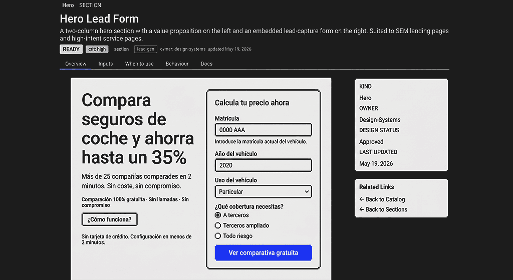 Documented interface of HeroLeadForm as a system section
The interesting thing is that the system does not stop at the visual surface. It also places components and sections into their real-world context: where they are deployed, what objective they help fulfill, and what level of care is required to modify them.
The documentation itself establishes it as a section suited for high-intent user journeys, where the form is a direct component of the conversion funnel. It also makes it clear when it should not be used and when it is better to compose primitives directly within the consumer application.
The system now models more than UI
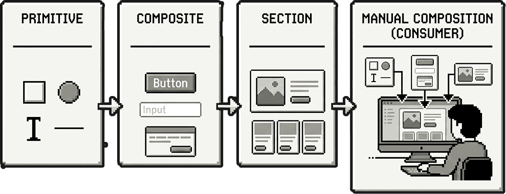
One of the aspects that shifts the most as the system matures is that the registry no longer merely describes interfaces. It describes context. There is a layer to decide whether an element should be a primitive, a section, or a manual composition; another to model criticality and business impact; another to locate pieces within the conversion funnel; and another to declare brand compatibility, i18n keys, and usage restrictions.
 Hierarchy and abstraction layers within the registry
This transforms the design system into a much more useful tool for senior product teams. It is no longer just about aligning UI design, but about making better engineering and maintenance decisions. You can argue whether a component deserves to be promoted to the system core, how much it costs to alter its contract, where it works well, and where it shouldn’t be forced.
And all of this happens without mixing layers. The documentation is designed precisely to prevent the system from turning into an unstructured metadata soup: each dimension has its own canonical doc, its clear semantics, and its designated place for modification.
Brand and locale without contaminating components
Another clear indicator of system maturity is how branding and internationalization are handled. The rule is simple yet vital: React components should have no knowledge of the active brand or active locale. They receive props, consume semantic tokens, and render; visual variance is handled entirely within the token architecture, and language variation is resolved in the integration layer before reaching the component.
It seems like a small constraint, but it carries immense impact. When brand logic or copy enters shared system components, the ecosystem becomes fragile, harder to maintain, and prone to local exceptions.
Here, the strategy is the exact opposite. Tokens are the absolute visual source of truth, featuring an explicit cascade between core tokens, brand collections, and modes. Components only consume semantic aliases like --color-primary or --color-bg—never hardcoded hex values or specific brand tokens. This allows the same component to adapt flawlessly to different brands or themes without needing any internal context.
Publishing for reuse
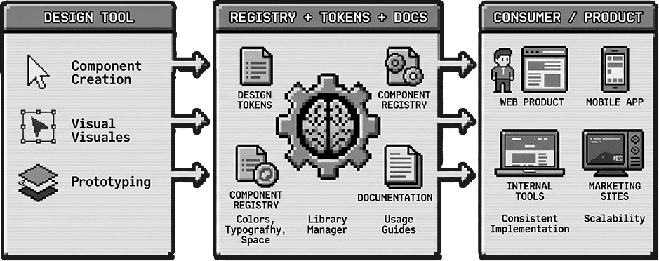
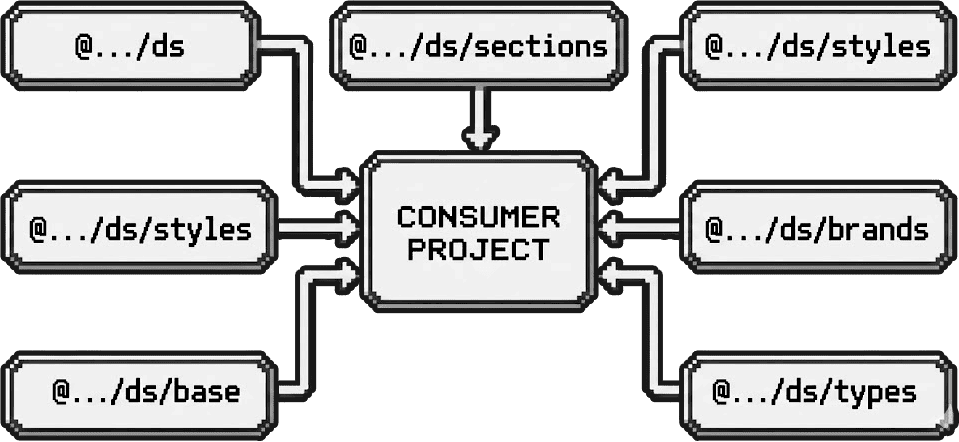
This approach unlocks its full potential when the system is no longer locked inside its own catalog interface. A code-ready design system can be compiled and published as an npm package consumable by other services, exposing isolated entrypoints for components, sections, styles, base, brands, and types.
 Packaging architecture and independent entrypoints
This completely changes the nature of the design system. It is no longer a static reference guide that engineering skims to implement layouts, but a real foundational library imported directly into external repositories. The difference between “reading documentation” and “consuming the architecture” is massive.
I also appreciate that this distribution process avoids bundling unrelated layers under a single flag. For instance, the entrypoints for styles and base cleanly decouple the definition of the visual language from its actual layout application to the DOM. One sets the contract; the other applies that contract to elements and layouts.
Built for design, frontend, and LLMs
There is another detail that I find essential and will likely shape design systems in the coming years: the documentation is not written solely for human consumption. The structural workflows, layer separation, and strict schema contracts mean this base is intentionally engineered for design, product engineering, and LLM-assisted workflows. The editing pathways and rules are explicit enough for an automated engine to navigate and operate on them without inventing arbitrary semantics along the way.
If you want a system that can be consumed by multiple distinct actors—humans, cross-functional teams, tooling, or automation engines—it cannot live trapped inside a mockup file or an ambiguous repository. It must live inside a strict contract, strong typing, structured tokens, documentation, and explicit governance rules.
The goal is not to eliminate visual design tools. It is about ensuring the system survives them.
Towards new projects
And perhaps that is the most fascinating part of this journey. Once you operate a published design system backed by a clean contract, actionable metadata, reusable layout sections, and native support for multi-brand and localization contexts, you are incredibly close to leveraging it as an engine to spin up entirely new applications.
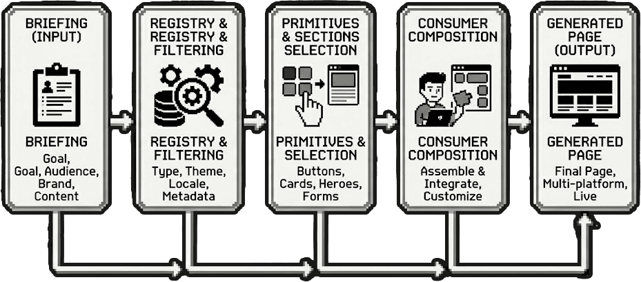
 Complete workflow from the initial briefing to the generated page
In this paradigm, the input is no longer “let’s draw an interface from scratch,” but rather a highly structured parameter set: what is the core objective, what content assets do we have, what languages does it require, what brand token context applies, and what level of component composition fits best.
This does not replace creative design thinking. But it profoundly redefines its starting point. Instead of beginning by reinventing infrastructure, you start by executing product decisions on top of a base that is already operational.
Composing in the consumer
This setup introduces an especially powerful option: every new page does not need to exist ahead of time as a rigid, predefined layout template. In many scenarios, a consumer app could assemble it dynamically directly from core system components, provided the briefing defines structure, content, objectives, languages, and branding.
The crucial detail here is that an LLM would not have to invent an interface out of thin air. It would compose elements over a strictly defined contract: what modules exist, what abstraction layer they belong to, when it is optimal to use a pre-built section, and when it is better to assemble components manually in the consumer layout.
Briefing (Input)
1. InputThe core goals of the site, target persona, brand targets, language sets, and primary content matrix for the new flow are defined.
Registry & Filtering
2. ContractThe layout engine queries the registry to discover the primitives, sections, and constraints that apply to the active brand and context.
Asset Selection
3. SelectionStable layout sections or foundational primitives are matched based on the level of abstraction dictated by the journey.
Composition
4. IntegrationThe consumer layer—or an LLM-driven workflow—assembles the page using the active system infrastructure without overriding styles or duplicating visual logic.
Output (Production)
5. ProductionThe resulting page is deployed instantly, natively linked to the design system infrastructure, fully on-brand, accessible, and ready to evolve.
This completely shifts the core value proposition of a design system. It is no longer just a UI component library; it becomes a structured operating engine enabling teams and machine models to construct digital products with maximum speed and zero ambiguity.
What we are really building
If I had to summarize everything in a single core thesis, it would be this: a code-ready design system should not aim simply to be the visual source of truth. It must aim to be the absolute operational source of truth to build software products independently of any single interface tool.
And to me, that is precisely the milestone where a design system moves past being a UI kit and starts becoming a true product platform.
The next natural step in this series will be to dive into the core of that thesis: why the registry framework matters so much and how it transitions from a simple component inventory into a running contract and decision layer.